UI Design
Pharmacies, optical stores, conferences, residentials, etc.
The one about meat industries
The design of the one-page website was carried out for a company in the meat industry sector, which is characterized by having a strong and distinctive personality.
Therefore, the decision was made to apply design elements such as grotesque typography, intense and contrasting colors, prominent photographs, and a wide page layout, with the aim of reflecting the strength and character of the brand.

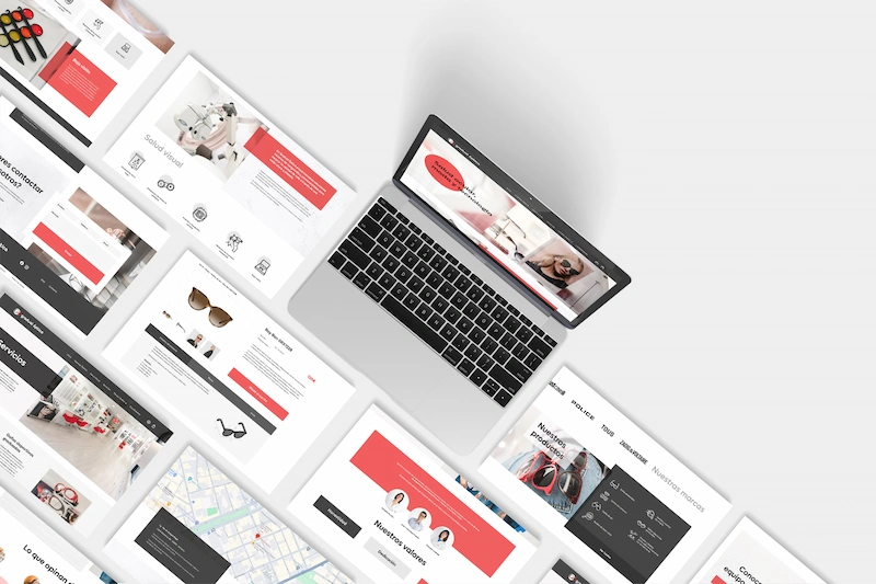
The one about the optical store
A corporate website was designed for Gradual Óptica, aimed at providing information about their services to users in an engaging way.
Motion effects, tabs, and dropdown menus were integrated to enhance interaction and accessibility to information.
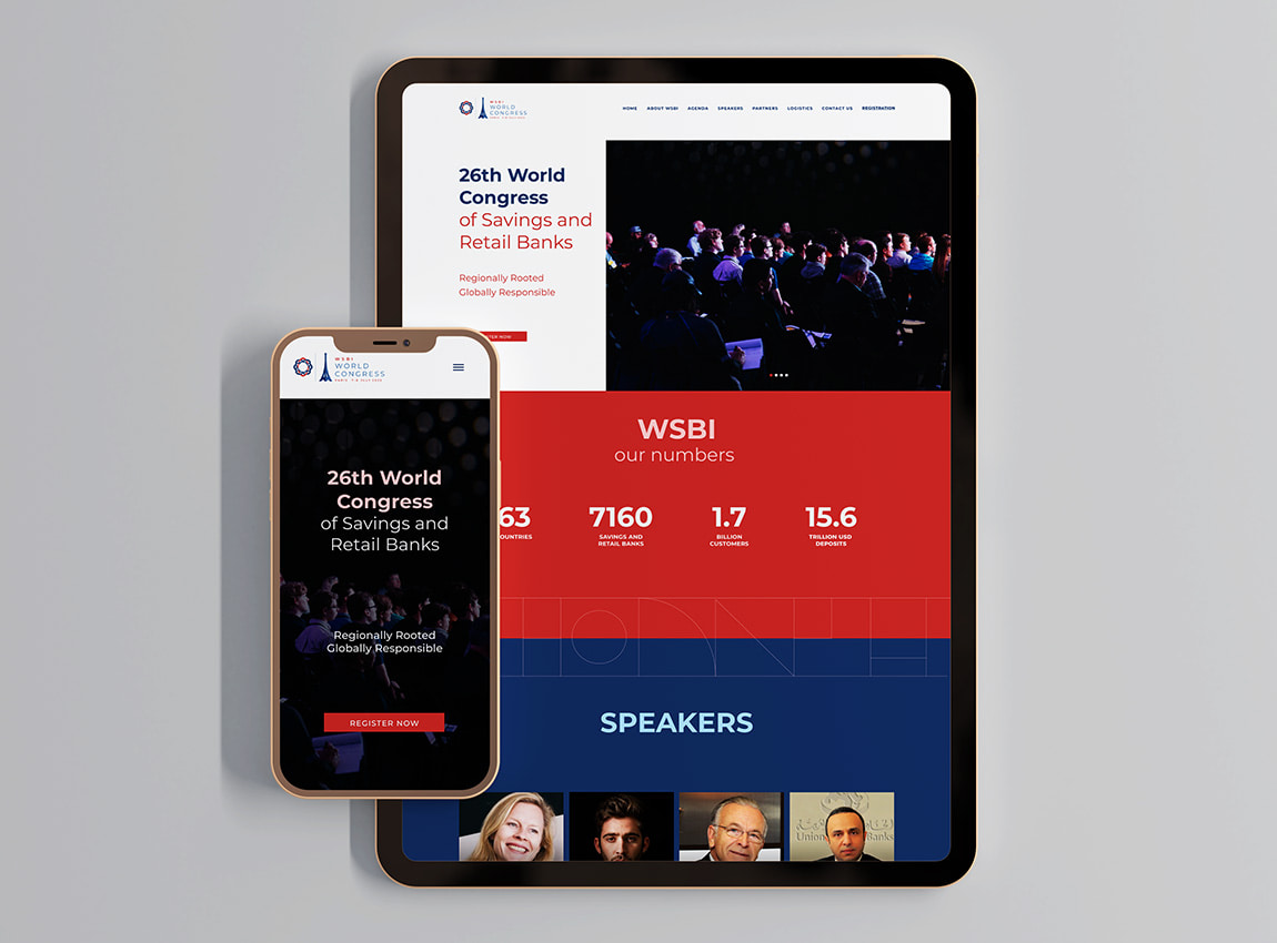
The one for the savings banks congress
We carried out responsive web design for the 26th International WSBI Congress, a global congress for savings banks and retail held in Paris.
Colors from the French flag were chosen, and a legible typography with various weights for devices. Additionally, icons were designed following a linear and geometric aesthetic.
We started with mobile device design and then adapted it for larger screens.
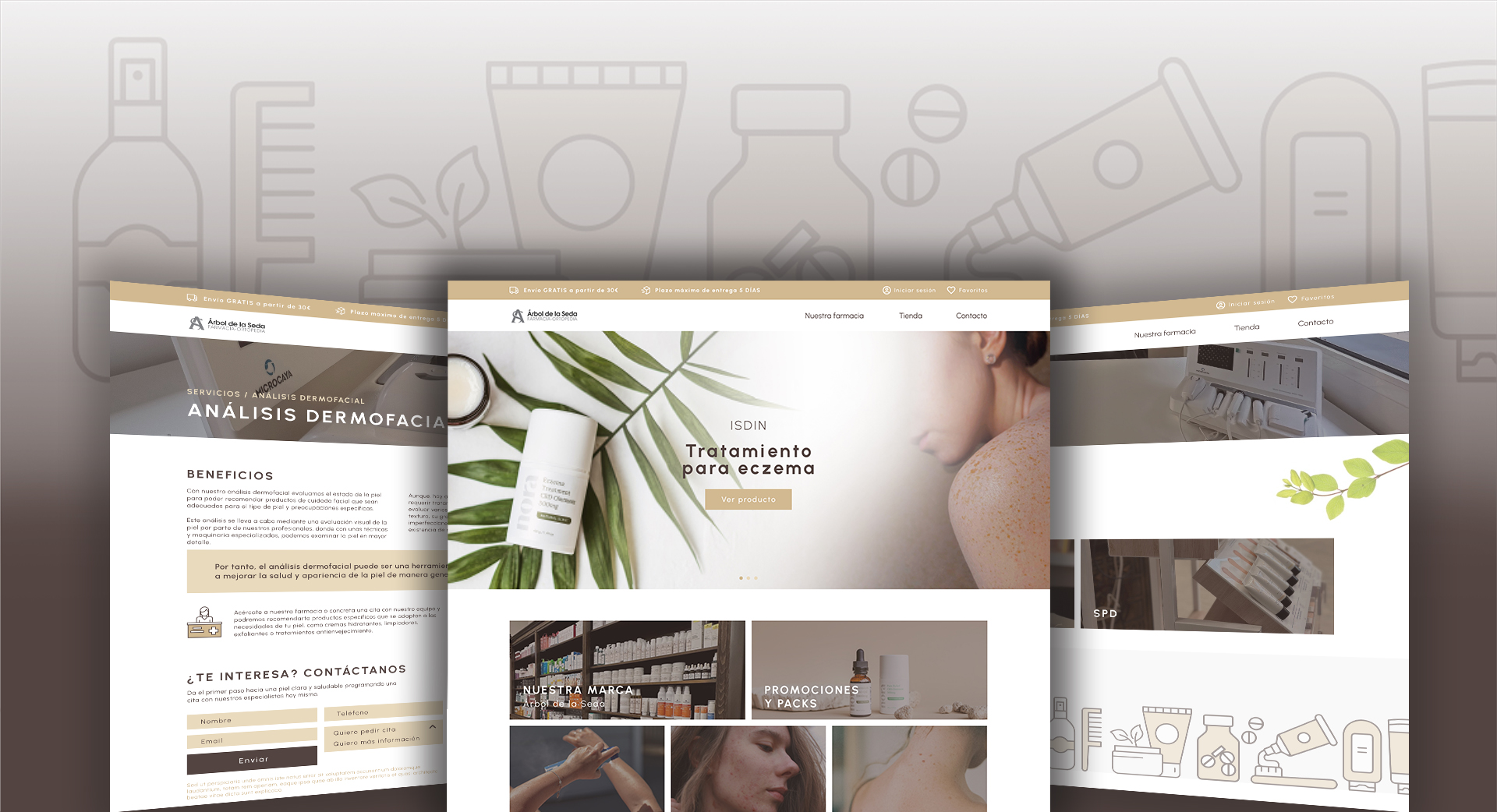
The one about pharmacy
The design of the interface aimed to convey a sense of naturalness and simplicity, which is why earthy colors, sans-serif typography, and visual resources with plant motifs were chosen. These design decisions helped create a welcoming and warm atmosphere.
To complement the website design, some icons were created in the same graphic style, which were used to represent the different product categories and some sections of the website. These icons help users quickly identify different content and categories, making navigation easier and improving the user experience.
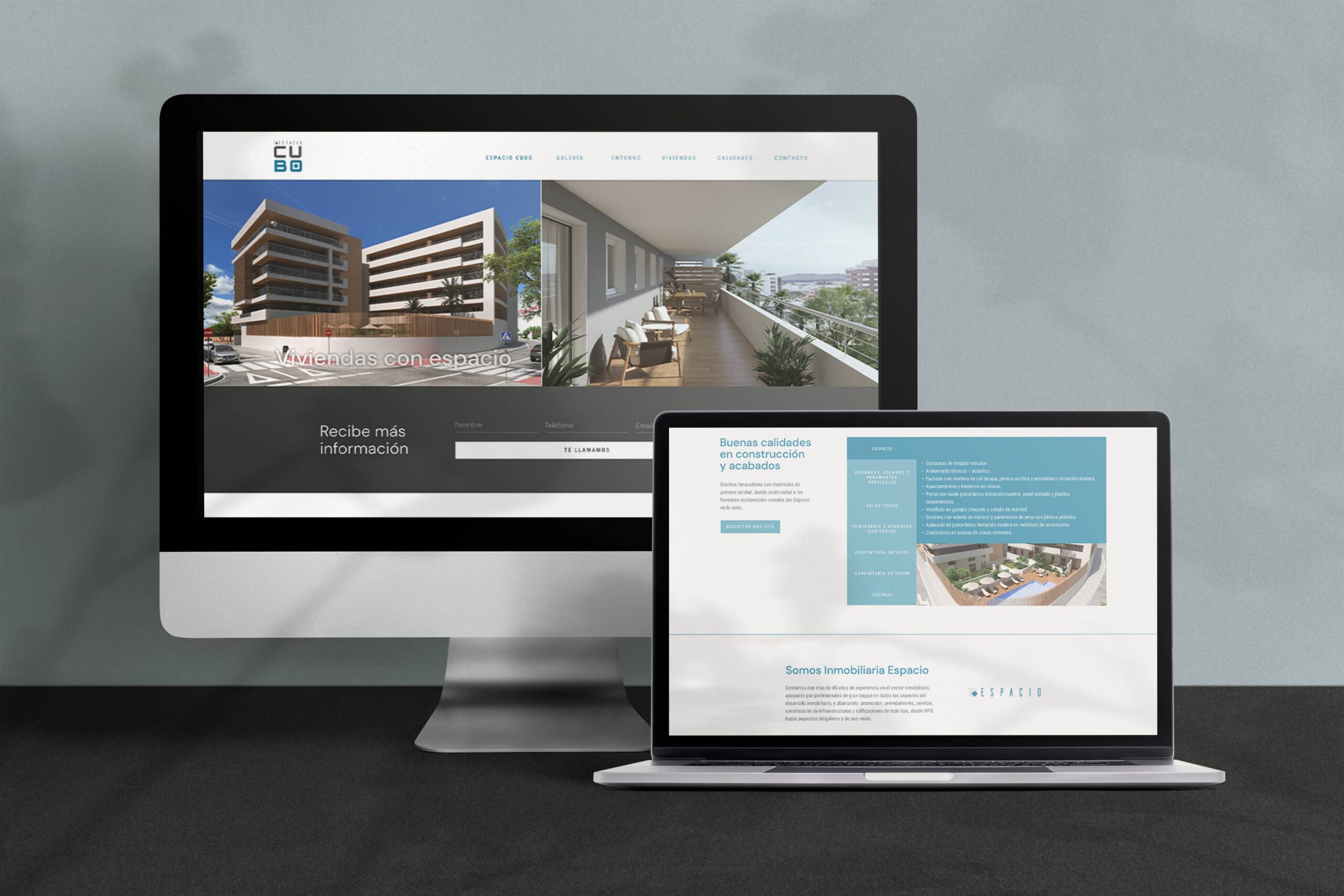
The one about the residential
The webpage for this residential development was designed to complement the building's structure and the name of the urbanization, with a design style incorporating right angles.
It was considered important for the design to be highly visual in order to draw the user's attention, so large images were incorporated and an exclusive collection of icons was created for the promotion of the project.
In this way, the essence of the residential project was effectively and attractively conveyed to the user.

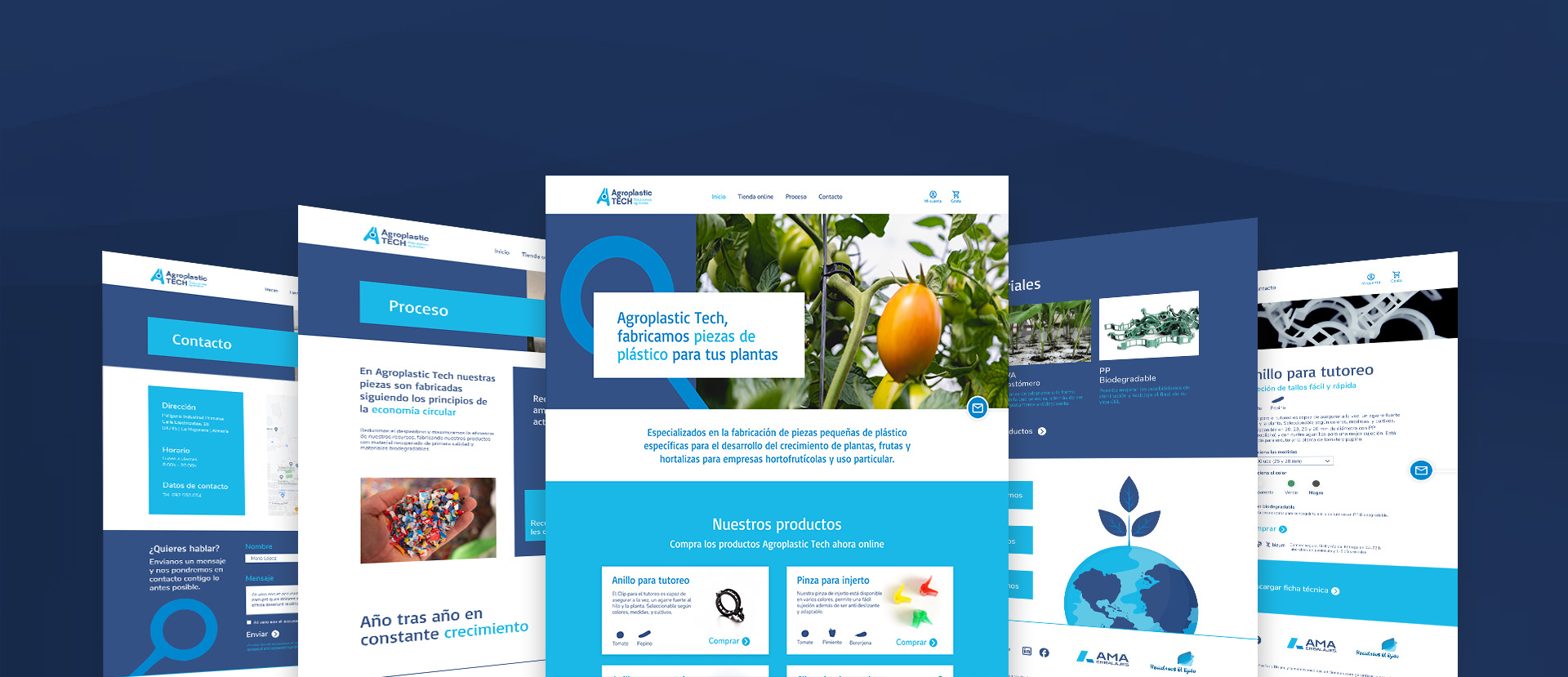
The one about agricultural parts
In the design of the interface of the website of an ecommerce of plastic pieces for plant growth, we were inspired by the brand's logo. We used its colors and chose typography with personality and solid and round graphic resources, which contrast with rectangular blocks.
These design decisions resulted in a coherent and attractive website for the user, which effectively conveys the essence of the brand.